Presenting data is more efficient with visual aids. Pie charts and bar graph are used everyday in presentations, meetings or reports.
We are used to them…..and sometimes bored by them. They often looked all the same.
This is a regular pie chart. The kind we sees regularly in presentation. This one is about Star Trek fans preference.
Questioned fans indicate « The Next Generation » as their prefer Star Trek (this detail is not related to my point. It is just to satisfy your curiosity). Source : Trekmovie.com
It is possible to add some creativity in the data presentation. If you have a creative visualization, you will keep your audience attention instead of boring them.
I suggest that you boldly go beyond pie chart (I am influenced by the last Star Trek movie. I loved it)
To help you, here is some examples of data visualization that goes beyond pie chart
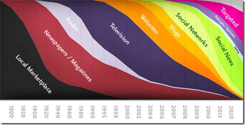
This graph indicate the evolution of media: “we are going to take a little tour through the history of information, or more specifically, where to focus your efforts if you want get in touch with other people”
Source: baekdal.com
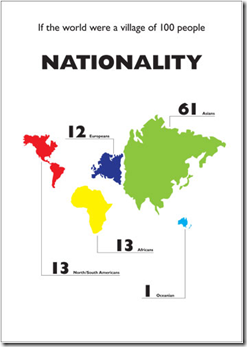
If the world was village of 100 people, is a series of world’s statistics. The creativity of the visual is obvious.
More here : The World of 100
The last example illustrate the evolution of the difference of salary between an average worker and a CEO from 1970 to 2005. I am not an economy specialist, but it help me understand one of the problem that led to the actual crisis.
Source: portfolio.com
Before ending this post, I added those to pictures of Star Trek. They have inspired the title: To boldly go beyond pie chart.
Those images are powerful. They capture the personality of Kirk and Spock. Enjoy them in full screen by clicking on them.
Share with me: What creative visuals did you use lately?
Posted by Denis François Gravel

Denis François Gravel aide les organisations à performer en contexte de présentation pour que leurs prestations donnent les résultats souhaités. Il les accompagne dans l’acquisition de meilleures pratiques et dans le développement des habiletés de leur équipe.
Il est le fondateur de PRÉSENTabilité, le cofondateur de TEDxQuébec et a été l’hôte de PechaKucha Québec. (2)


